


Creating an Effective Trading Journal: What It Should Look Like
Creating an Effective Trading Journal: Key Elements and Examples Trading is a complex and fast-paced activity, where even the smallest details can …
Read Article
If you’re a stock trader or investor, you’ve probably heard of Bollinger Bands. Created by John Bollinger, these technical analysis tools are used to measure volatility and identify potential trend reversals. The bands consist of a middle line, which is usually a moving average, and upper and lower bands that are based on standard deviations.
Adding Bollinger Bands to your Excel worksheet can provide valuable insights into the price movements of a stock or other financial instrument. By visually representing the volatility and potential support and resistance levels, Bollinger Bands can help traders make more informed decisions.
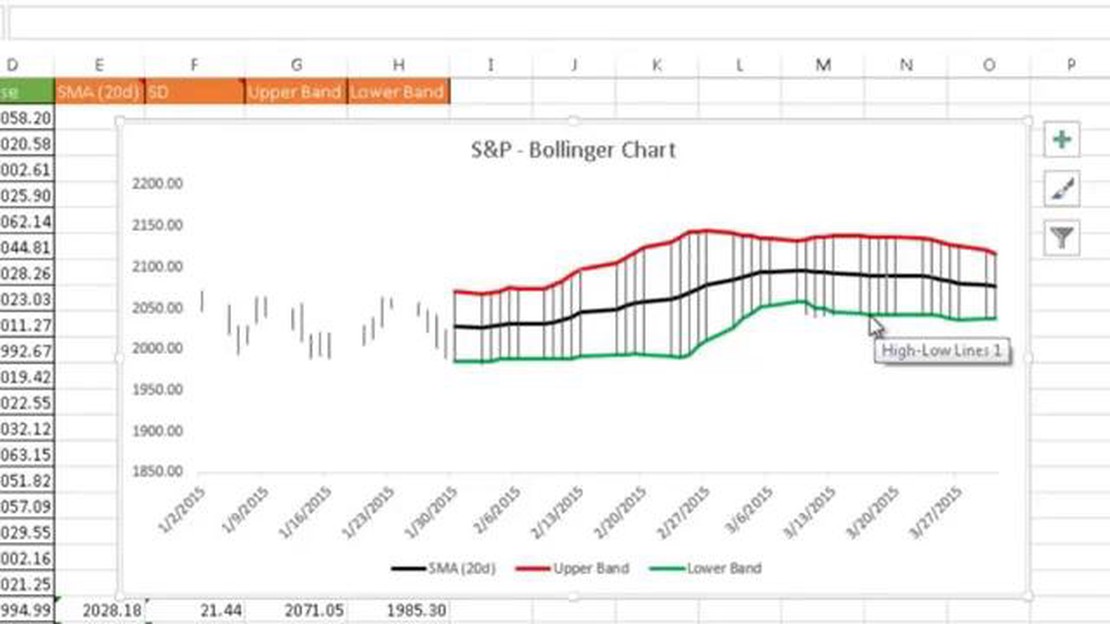
To add Bollinger Bands in Excel, you’ll need to calculate the middle band, upper band, and lower band values. You can use Excel’s built-in functions and formulas to do this. First, calculate the middle band by selecting a moving average period, such as 20 days, and calculating the average closing price over that period. Next, calculate the upper band by adding a multiple of the standard deviation, typically 2, to the middle band. Finally, calculate the lower band by subtracting the same multiple of the standard deviation from the middle band.
Once you have calculated the middle, upper, and lower band values, you can plot them on a chart in Excel. Use the line chart or scatter chart type and include the date or time on the x-axis and the price on the y-axis. Plot the middle band as a solid line in the center of the chart, and the upper and lower bands as dashed lines above and below the middle band.
By adding Bollinger Bands in Excel, you can enhance your technical analysis capabilities and improve your trading decisions. Experiment with different moving average periods and standard deviation multiples to find the settings that work best for the specific stock or financial instrument you’re analyzing. Remember, Bollinger Bands are just one tool in the trader’s toolbox, and they should be used in conjunction with other technical indicators and fundamental analysis to make well-rounded trading decisions.
Bollinger Bands are a technical analysis tool that was developed by John Bollinger in the 1980s. They are a widely used indicator in financial markets, particularly in the field of technical analysis.

Bollinger Bands consist of three lines: a middle band, an upper band, and a lower band. The middle band is typically a simple moving average, and the upper and lower bands are calculated by adding and subtracting a standard deviation from the middle band.
Read Also: Advantages of Using FPGA Instead of ASIC: Explained
These bands are used to measure the volatility of a financial instrument and to identify potential price reversals. When the price is moving within the bands, it is considered to be in a range. However, when the price breaks out of the bands, it is seen as a signal of a significant price move.
Bollinger Bands can help traders to determine when a market is overbought or oversold. When the price reaches the upper band, it suggests that the market is overbought and may be due for a correction or a reversal. On the other hand, when the price touches the lower band, it indicates that the market is oversold and may be due for a bounce or a reversal.
Traders also use Bollinger Bands to identify trading opportunities. For example, when the price is trading near the lower band and starts to move higher, it can be a signal to buy. Similarly, when the price is trading near the upper band and starts to move lower, it can be a signal to sell.
Bollinger Bands can be added to a chart in Excel using the built-in charts and graphing tools. By following a step-by-step guide, you can easily add the Bollinger Bands to your Excel charts and analyze the price movements of financial instruments.
Adding Bollinger Bands to your Excel charts can help you analyze and interpret financial data more effectively. Bollinger Bands are a popular technical analysis tool that provides insights into price volatility and potential trading opportunities. In this step-by-step guide, we will walk you through the process of adding Bollinger Bands to your Excel charts.
By following these step-by-step instructions, you can easily add Bollinger Bands to your Excel charts and gain valuable insights into price volatility and potential trading opportunities. Experiment with different settings and interpretations to find what works best for your specific needs.
Bollinger Bands are a technical analysis tool that consists of a middle band, an upper band, and a lower band. The middle band is usually a simple moving average, while the upper and lower bands are calculated as standard deviations from the middle band.
To add Bollinger Bands in Excel, you need to calculate the moving average for the middle band, as well as the upper and lower bands based on the standard deviation. Once you have the calculations, you can plot the bands on a line chart in Excel.
Read Also: How to Turn Around a Poor Stock Portfolio: Tips and Strategies
Bollinger Bands are used by traders and analysts to identify potential overbought or oversold conditions in a market. When the price of an asset moves close to the upper band, it may be considered overbought, while a move close to the lower band may indicate an oversold condition.

Bollinger Bands alone cannot predict future price movements with certainty. They are a tool that helps identify potential overbought or oversold conditions in a market, but other analysis and indicators should be used to make informed trading decisions.
Bollinger Bands can be used on a wide range of financial instruments, including stocks, commodities, Forex, and cryptocurrencies. However, different instruments may require different parameter settings for the bands to be effective.
Bollinger Bands are a technical analysis tool that helps traders to identify potential price reversals and volatility in the market. They consist of three lines: the middle band, which is a simple moving average; and the upper and lower bands, which are calculated by adding and subtracting a standard deviation from the middle band, respectively. When the price touches the upper band, it is considered overbought, and when it touches the lower band, it is considered oversold. Traders can use Bollinger Bands to determine entry and exit points for their trades.
Yes, you can add Bollinger Bands to your Excel spreadsheet. To do this, you will need to calculate the middle band, upper band, and lower band using the appropriate formulas. Once calculated, you can plot the bands on your Excel chart to visualize the price movements. There are also Excel add-ins available that can automatically calculate and plot Bollinger Bands for you.

Creating an Effective Trading Journal: Key Elements and Examples Trading is a complex and fast-paced activity, where even the smallest details can …
Read Article
What is intraday option? Day trading is a popular and exciting form of trading where traders buy and sell financial instruments within the same …
Read Article
Is buying a stock the same as buying an option? Stocks and options are two commonly discussed investment options in the financial world. While they …
Read Article
Mastering the Art of Using Bollinger Bands for Trading Success Bollinger Bands are a popular technical analysis tool used by traders to assess market …
Read Article
Who is Jacques Celliers? Jacques Celliers, a captivating leader known for his innovative approach and unwavering determination, has made a profound …
Read Article
Options Trading on Leveraged ETFs Explained: Can You Do It? Options trading can be a complex and risky endeavor, but for those willing to take the …
Read Article


