The z-score chart, also known as the standard score chart, is a valuable tool in statistics that helps us understand the relative position of a data point within a distribution. It provides a standardized measure of how far a given observation is from the mean, allowing us to compare data points from different distributions or variables. The z-score chart is widely used in various fields, including finance, psychology, and quality control.
The z-score, represented by the letter “z,” is calculated by subtracting the mean of a distribution from a specific data point and dividing the result by the standard deviation. This calculation allows us to express a data point’s distance from the mean in terms of standard deviations. A positive z-score indicates a data point above the mean, while a negative z-score indicates a data point below the mean.
Table Of Contents
For example, let’s say we have a z-score of 2. This means the data point is two standard deviations above the mean. By consulting the z-score chart, we can determine the percentage of data points that fall within a certain range of values. In this case, a z-score of 2 corresponds to approximately 97.72% of the data falling below that point.
The z-score chart is useful for several reasons. First, it allows us to assess the relative standing of a data point within a distribution. By comparing z-scores between different data points or distributions, we can determine which observations are more extreme or unusual. Additionally, the z-score chart enables us to identify outliers, which are data points that deviate significantly from the rest of the distribution. Outliers may indicate errors in data collection or important phenomena that require further investigation.
Understanding the z-score chart
The z-score chart, also known as the standard normal distribution table, is a valuable tool in statistical analysis. It provides a reference for determining the probability of a particular value occurring in a standard normal distribution. By understanding how to use this chart, you can make more informed decisions and draw accurate conclusions from your data.
At its core, the z-score chart allows you to convert raw data into standardized scores, which can then be compared to the standard normal distribution. The standard normal distribution is a bell-shaped curve with a mean of 0 and a standard deviation of 1. By converting your data into z-scores, you can determine how many standard deviations away from the mean a particular value falls.
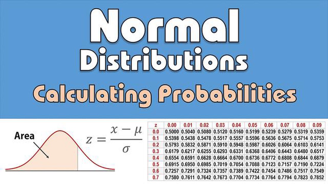
The z-score chart is organized in two dimensions: the first dimension represents the digits before the decimal point, while the second dimension represents the digits after the decimal point. These digits correspond to the z-score values. For example, if you are looking for the z-score for a value of 1.35, you would locate the row for 1.3 and the column for 0.05, and the corresponding value in the chart would be 0.9104.
The z-score chart is particularly useful when dealing with large data sets, as it allows you to easily determine the proportion of data that falls within a certain range. For example, if you want to know what percentage of data falls within one standard deviation of the mean, you can use the z-score chart to find the corresponding z-score value, which represents the proportion of data in that range.
In addition to helping with data analysis, the z-score chart is also used in hypothesis testing and determining confidence intervals. It allows you to compare observed values to expected values and assess the statistical significance of your findings. By understanding how to interpret the z-score chart, you can effectively communicate your results and draw meaningful conclusions.
In conclusion, the z-score chart is an important tool in statistics that allows you to convert raw data into standardized scores and compare them to the standard normal distribution. By understanding how to use and interpret this chart, you can gain valuable insights from your data and make informed decisions. Whether you are analyzing large data sets, conducting hypothesis tests, or determining confidence intervals, the z-score chart is an essential resource for statisticians and data analysts alike.
Exploring the concept of the z-score
The z-score is a statistical measure that helps to standardize and compare data points in a dataset. It provides insight into how far a particular data point is from the mean of the dataset, measured in terms of standard deviations. By converting the original data value into a z-score, it becomes easier to understand and interpret the relative position of that data point within the dataset.
The concept of the z-score is based on the normal distribution, also known as the bell curve. In a normal distribution, the majority of data points are clustered around the mean, with fewer data points in the tails of the distribution. The z-score allows us to understand where a specific data point falls within this distribution, indicating whether it is closer to the mean or an outlier.
To calculate the z-score of a data point, the formula is used: z = (x - μ) / σ, where x is the data value, μ is the mean of the dataset, and σ is the standard deviation. The resulting z-score can be positive or negative, depending on whether the data point is above or below the mean. A z-score of 0 means the data point is exactly at the mean.
The z-score chart, also known as the standard normal distribution table, provides a tool for quickly looking up the corresponding probability value of a given z-score. The chart displays the area under the curve to the left of each z-score, which represents the cumulative probability up to that point. This can be useful in performing statistical calculations and making conclusions about the dataset.
Understanding the z-score is essential in various fields, such as finance, economics, and healthcare. It helps in identifying outliers, comparing data points from different datasets, and making predictions based on the given dataset. By using the z-score, analysts and researchers can make informed decisions by considering the relative position and significance of individual data points within the dataset.
In conclusion, the z-score is a powerful statistical measure that provides a standardized way of understanding and interpreting data points. It allows us to compare data across different datasets, identify outliers, and make data-driven decisions. The z-score chart further enhances the usefulness of the z-score by providing a quick reference for interpreting the cumulative probability associated with a specific z-score.
FAQ:
What is the z-score chart and why is it important?
The z-score chart is a statistical tool that helps in determining where a particular data point lies in relation to the mean of a dataset. It is important because it allows us to make comparisons between different data points and understand the relative position of each point.
How do you interpret the z-score chart?
The z-score chart is interpreted by comparing the z-score value obtained for a data point to the standard normal distribution. A z-score of 0 indicates that the data point is exactly at the mean, positive z-scores indicate data points above the mean, and negative z-scores indicate data points below the mean. The further away the z-score is from 0, the further away the data point is from the mean.
What is the formula for calculating the z-score?
The formula for calculating the z-score is (x - μ) / σ, where x is the data point being analyzed, μ is the mean of the dataset, and σ is the standard deviation of the dataset. This formula gives us the number of standard deviations the data point is away from the mean.
Can the z-score chart be used for any dataset?
Yes, the z-score chart can be used for any dataset that follows a normal distribution. However, it may not be effective for datasets that do not follow a normal distribution. In such cases, alternative statistical tools may need to be used.
Can AI Trading Bots Really Make a Profit? With the rapid advancement of technology, artificial intelligence (AI) has become a hot topic in the trading …
Understanding the 4 Week Rule in Forex Trading Forex trading is an exciting and challenging market that offers numerous opportunities for profit. With …