


Is AQW Trading Available? Exploring the Trading System in AQW
Is there trading in AQW? AdventureQuest Worlds (AQW) is an online multiplayer role-playing game where players can embark on epic quests, battle fierce …
Read Article
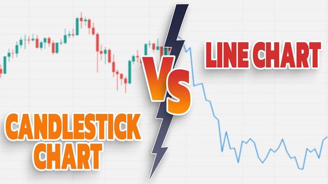
In the world of financial trading and analysis, charts are an essential tool for understanding price movements and making informed investment decisions. Two popular types of charts used by traders are the line chart and the Japanese candlestick chart. While both types of charts provide valuable information, many traders consider the Japanese candlestick chart to be the superior choice. Here’s why.
One of the main reasons why the Japanese candlestick chart is preferred over the line chart is because it provides more detailed and comprehensive information about price movements. Unlike the line chart, which only displays the closing prices of a certain period, the Japanese candlestick chart includes the opening, closing, high, and low prices within the specified time frame. This additional data allows traders to see the full range of price fluctuations and helps in identifying market trends.
Another advantage of the Japanese candlestick chart is its visual representation of market sentiment. Each individual candlestick on the chart represents a specific time period, such as a day or an hour. The shape and color of the candlestick provide important clues about the buying and selling pressure in the market. Bullish candlesticks, usually represented in green or white, indicate that buyers are in control, while bearish candlesticks, often shown in red or black, suggest that sellers have the upper hand. This visual representation allows traders to quickly assess market sentiment and adjust their strategies accordingly.
The Japanese candlestick chart also offers a variety of candlestick patterns, which provide further insights into market dynamics. These patterns, such as doji, hammer, and engulfing, have specific meanings and can indicate potential reversals or continuations in price trends. By recognizing these patterns, traders can anticipate market movements and make more accurate predictions.
In conclusion, while the line chart is a simple and straightforward way to display price data, the Japanese candlestick chart offers a more comprehensive and visually appealing representation of market trends. With its detailed information, visual representation of market sentiment, and variety of candlestick patterns, the Japanese candlestick chart is undoubtedly the superior choice for traders looking to make informed investment decisions.
Japanese candlestick charts have several advantages over other types of charts, such as line charts, when it comes to analyzing financial market data:

Read Also: What is the Best App to Check the Dollar Rate? - Top Dollar Rate Checking Apps3. Candlestick Patterns: Japanese candlestick charts include various candlestick patterns, such as doji, hammer, engulfing, and spinning top. These patterns can indicate potential price reversals or trend continuations, providing traders with valuable signals for making trading decisions. 4. Historical Analysis: Japanese candlestick charts allow traders to analyze historical price data and identify patterns or trends over a specified period. This helps traders to develop trading strategies based on historical market behavior. 5. Compatibility with Technical Analysis Tools: Japanese candlestick charts can be used in conjunction with other technical analysis tools, such as moving averages, trendlines, and oscillators, to enhance the accuracy of market analysis and forecasting.
In conclusion, Japanese candlestick charts offer a comprehensive and effective way to analyze financial market data due to their visual representation, inclusion of detailed information, use of candlestick patterns, ability for historical analysis, and compatibility with other technical analysis tools.
One of the main advantages of Japanese candlestick charts over line charts is their ability to provide better visualization of market data. Candlestick charts display the same information as line charts, but in a more visually appealing and intuitive way.
The use of candlestick patterns allows traders to quickly identify and interpret price movements. Each candlestick represents a specific period of time, such as a day or an hour, and consists of four main components: the opening price, the closing price, the highest price, and the lowest price.
By analyzing the shape and color of the candlesticks, traders can spot patterns and trends that may not be as easily detectable on a line chart. For example, a long bullish candlestick with a small wick at the bottom indicates strong buying pressure and suggests that the price may continue to rise. On the other hand, a long bearish candlestick with a small wick at the top suggests strong selling pressure and a potential decline in price.
In addition to individual candlesticks, traders can also look at the overall formation of multiple candlesticks to identify patterns such as doji, hammer, shooting star, and engulfing patterns. These patterns provide valuable insights into market sentiment and can help traders make more informed decisions.
Read Also: Discover How the Forex Market Works with Slideshare
The use of color in candlestick charts also enhances visualization. Bullish candlesticks are typically represented with green or white color, while bearish candlesticks are represented with red or black color. This color scheme makes it easy for traders to quickly distinguish between bullish and bearish periods.
In conclusion, Japanese candlestick charts offer superior visualization compared to line charts. By providing a clearer representation of market data and allowing for the identification of patterns and trends, candlestick charts empower traders to make more informed decisions and maximize their trading potential.

A Japanese candlestick chart represents price movements using candlestick-shaped bars, while a line chart only displays the closing prices over a given period.
A Japanese candlestick chart provides more information about price movements as each candlestick bar shows the opening, closing, highest, and lowest prices during a specific time period. This makes it easier to analyze market sentiment and identify potential trading opportunities.
A Japanese candlestick chart can help in technical analysis by providing visual patterns and signals that indicate potential reversals or continuations in price trends. Traders often use candlestick patterns, such as doji, hammer, and shooting star, to make informed decisions about their trades.
One disadvantage of a Japanese candlestick chart is that it can be more complex and overwhelming for beginners compared to a simple line chart. Additionally, candlestick patterns are subjective and can sometimes lead to false signals if not interpreted correctly.

Is there trading in AQW? AdventureQuest Worlds (AQW) is an online multiplayer role-playing game where players can embark on epic quests, battle fierce …
Read Article
Forex Trading with $1000: Is It Possible? Forex trading has become increasingly popular in recent years, with many individuals looking to enter the …
Read Article
Choosing the Best Exponential Moving Average (EMA) for Trailing Stop Loss Trailing stop loss is a popular strategy used by traders to protect their …
Read Article
Risks of Credit Spread Options Credit spread options are a popular financial instrument that allow investors to speculate on the movement of credit …
Read Article
Understanding the Moving Average in Inventory Systems In inventory management, the moving average (MA) is a commonly used method for calculating the …
Read Article
Do Kroger employees receive stock options? Kroger is one of the largest grocery store chains in the United States, with thousands of employees across …
Read Article


